

 Going Mobile? Adapting your site to all mobile devices shouldn’t be a difficult task but should not be taken lightly either. If you’ve finally decided to go mobile, take the time to plan a good strategy on how to make it happen. As promised in our recent blog post, Go Forward, Go Mobile, Infolinks brings you the main factors you should consider before making this decision.
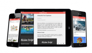
On your mark, get set, go mobile!
When converting your site to mobile, you have two main options: set up a responsive website or build a responsive web design. At first sight, these terms may seem a little confusing but the concepts themselves are easy to grasp. A responsive website is a different URL that is compatible with small screen devices.
Your visitors will be automatically redirected for your original URL thanks to a simple code. A responsive design is content adapted for different screens without the need of a different URL. In other words, you only have to build one design and the content will adjust accordingly to the device it is viewed on.
Even though you will still need to limit and reorganize the content layout of your website no matter which conversion you choose, there are still some main differences between each option. Before deciding which way to go, ask yourself the following questions:
How much time and money can I spare?
Responsive websites are set up pretty quickly and are less expensive, but updating two sites will require additional work. On the other hand, a responsive design is more costly to create but once it’s built, it’s maintenance is minimal.
Where is my traffic coming from?
Analyze where your traffic is coming from: desktop, laptop, smartphone, or tablet? This will give you a better idea of the areas you should emphasize in order to adapt a mobile-friendly website for your audience.
What should I include?
Keep your user in mind in order to design and tailor your content accordingly. Remember, it’s not just about eliminating content, but designing it for mobile viewing.
Done is better than perfect
So, what do you need to do in order to have a mobile-friendly site? If you’re familiar with programming, you can convert your site on your own after doing some online research. If this is not an option, you can turn to external services that can help you with the transition. Dudamobile or MobiSiteGalore offer to create responsive websites in only 15 minutes! On the other hand, services like bmobilized or Mobify facilitate the responsive design conversion.
Regardless of your decision, you should continue to analyze your traffic and measure your user behavior. Try not to become frustrated if you don’t see automatic results. Use your data to further optimize your content and improve viewer engagement. You should see more conversions and an increase in revenue in no time!