

Physical changes are often the reflection of greater internal ones, and this is the case here at Infolinks. Our recent rebranding and entire new Infolinks design mirrors how our company and platform have grown and evolved. From simply an InText advertising platform, we now offer the leading solutions for native advertising with our multiple ad solutions which combat banner blindness and deliver true engagement.
The first challenge was to find the right design company to accomplish our rebranding goals and help us hit our new messaging targets. So we enlisted the help of As We Design, an innovative and fresh design team, to take on the challenge of creating the new Infolinks and portray our brand with these values in mind.
The Evolution of the New Infolinks Design
The Logo Evolution
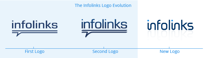
Infolinks is a pioneer in the InText advertising industry and that was our first and only product initially. So of course, our original logo encapsulated this with a double underline under our name and a small indentation reflecting the design of our ad bubble.
With the growth of our company it was time to truly convey who Infolinks is . . . not just an InText ad provider, but a multi-solution advertising platform, unified and strong. Our new logo is simple and sleek, much like our newly rebranded ad suite.
Unified Product Suite
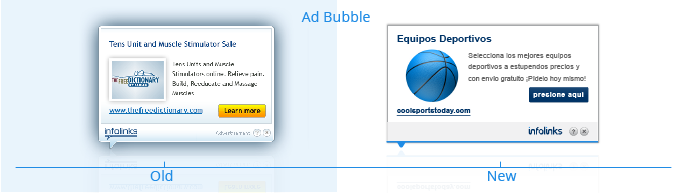
Before our rebranding, each new ad product we introduced became sort of its own entity, not reflecting via design how it was connected to Infolinks’ brand – they were missing a cohesive look. As We Design took on the major task of helping us unify them so that each would blend nicely on websites and clearly resemble Infolinks brand messaging.
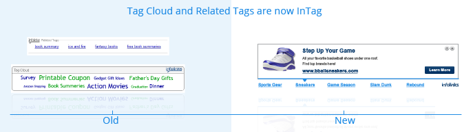
Our emphasis is on the IN of Infolinks and each new product and product logo follows this common thread. InSearch, InTag, InFrame and InText are all unified and functioning on the power of our In3 platform. Our aesthetic now reflects this value. Now you can customize your ad units with one of the 7 different colors on the Infolinks’ palette.

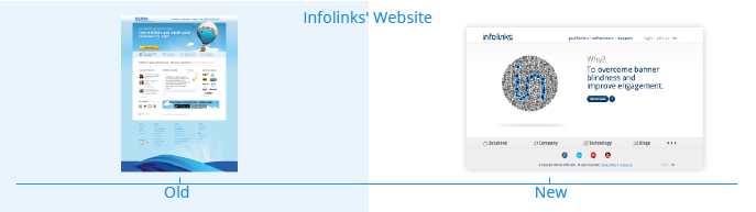
A Website You Want to Visit
Although the images shown on our previous website were fun and uplifting, (who doesn’t like hot air balloons?) it was time for us to focus on our main messages and values to clearly communicate the what, why, how and who of Infolinks. Our new website is a synch to navigate as it shies away from big footers or needless pages and instead simply and succinctly conveys our message. There are now 4 main footer sections (solutions, company, technology and blogs) which open up seamlessly at the bottom of the page. Instead of loud busy images, each graphic was thoughtfully created and placed on our site to illustrate each message in our content.
Our website content was also created with you in mind, keeping it fresh, simple and easy to understand, we purposely avoided big industry jargon and instead honed in on the important information you need to know. We also have a new Demo page, which allows you to test drive each ad and color to get the essence of how your favorite ad combo will appear on your site.
Infolinks Appreciation
We believe in giving credit where credit is due, and we would like to thank Ilan and Amir of As We Design for their tireless effort and fantastic final product. Their youthful outlook and fresh design technique has surely paid off for us.
“The Infolinks’ rebranding project was quite a feat, but the brand messaging was clear from the getgo and it made our job all the more rewarding as we knew exactly what direction we were headed. We are so proud of how Infolinks looks now.”
– Ilan Potash & Amir Kreichman.
Check out As We Design’s tumblr and Facebook page and let us know on Twitter and Facebook what you think about the #AllNewInfolinks!